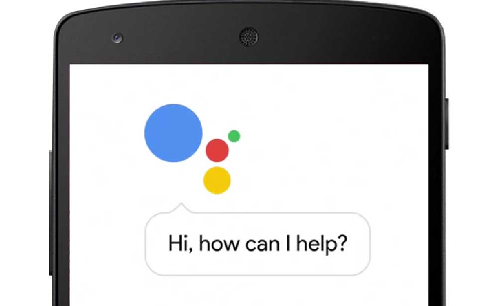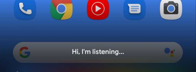
Recently, Google tests a new UI for its Google Assistant devices and it will be going to be better with a more minimalist design. The Google Assistant app is considered as one of the largest breakthrough creation of Google in the past few years. This application was once seen alongside with the original Google Pixel phones as a friendly device assistant. Now, it has evolved with general improvements and features which also includes its new upcoming minimalistic UI design.
Updated on 1 December 2025
Google Assistant App
This Google application is actually evolving in order to become a fundamental part of Google’s ecosystem. These days, you can hear people using Google Assistant commands on devices such as speakers, phones, cars, TVs, tablets, and many more. With its incredible compatibility, you can imagine it coming even on watches and door security devices in the future. It is actually a central part of our smartphones especially today more than ever before.
In the present time, if you press on to your phone’s home button. You will be able to see a white card along with the dialog of the app. It also includes suggestions and various shortcuts. But in the new UI, this white card is entirely removed with the suggestions with a black gradient taking its place.
The new minimalistic UI design is actually a part of Google’s new set of dark themes. More so, the shortcut for At a Glance, and keyboard will still remain. Google will also get a Google-themed unique color bar that is located at the bottom of the app. This appears like the light bar we first saw on different devices like Pixel C. These new additions and changes significantly increases the aesthetic appeal of the upcoming Google Assistant minimalistic UI.
Google Test
While many people want to get a clear answer about Google Assistant vs Alexa. The new app UI is still on its testing phase. In line with this, very few users get to see this new design according to reports.
Besides, updating your Google Assistant devices won’t actually allow you to see the new design either. But it might be possible depending on your mileage.
In addition to that, I generally researched about this new Google Assistant user interface design and it looks very clean. As a matter of fact, it is significantly minimalistic and you can see that it is totally better in terms of looks compared to the one we have in the present.
But behind its good looks, it will compromise a few functionalities as it will remove suggestions. Yet, you don’t have to be so sad about it because this new design is still on its A/B test. This means that there is a great chance that Google will reconsider adding its lost functionality again.
For those who are incredibly excited about this new UI design of Google Assistant. It is better to wait for it to roll-out first before celebrating. Because you might not get satisfied with what you will see if you expect too much on a Test App.


